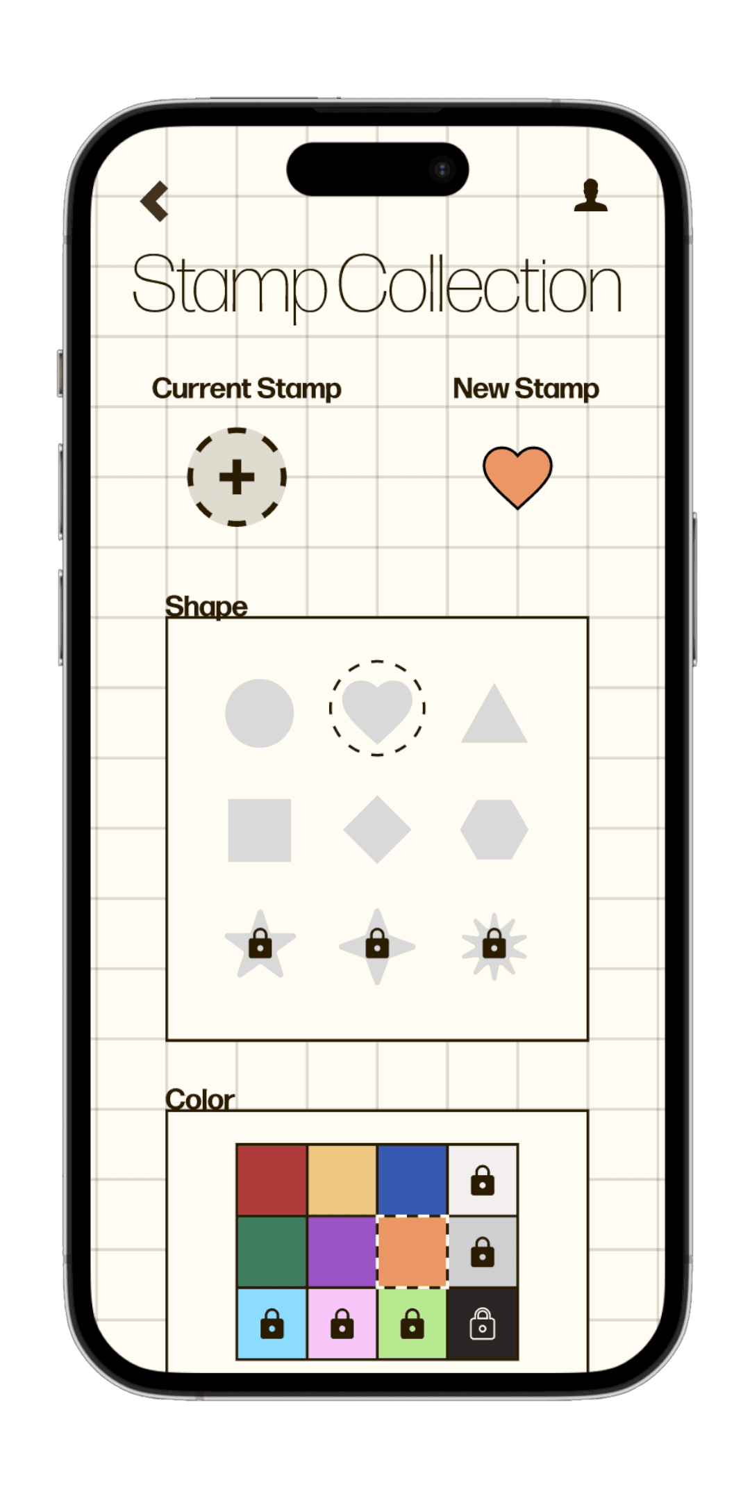
Stamps are also a finite, but ample resource that can be accumulated the more a user interacts with the app
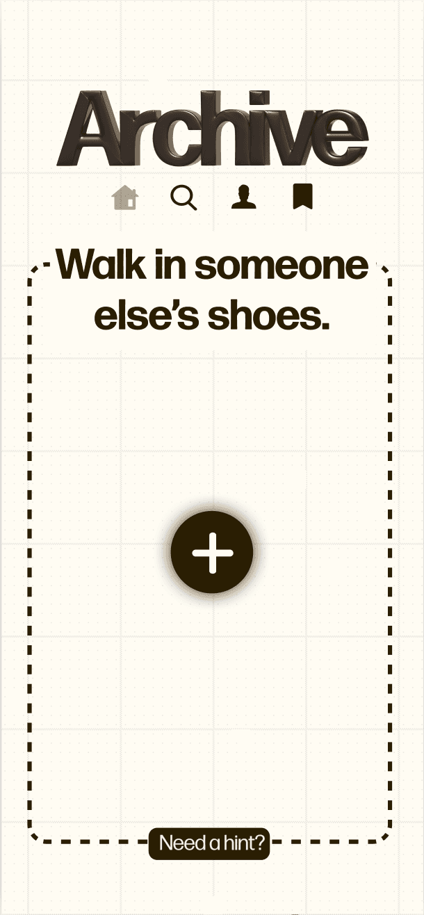
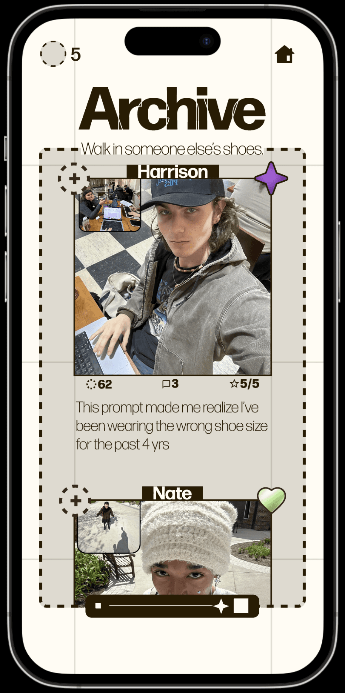
Archive’s UI is built around a bold, unique grid motif that blends seamlessly into the UX.
OVERVIEW
Stamps
Distinct UI
PROCESS
TAKEAWAYS
Try something
new everyday.

ARCHIVE
Roles & Skillsets
UX Research
UI/UX Design
Wireframing
User Testing
Interactive Prototypes
Team
2 designers


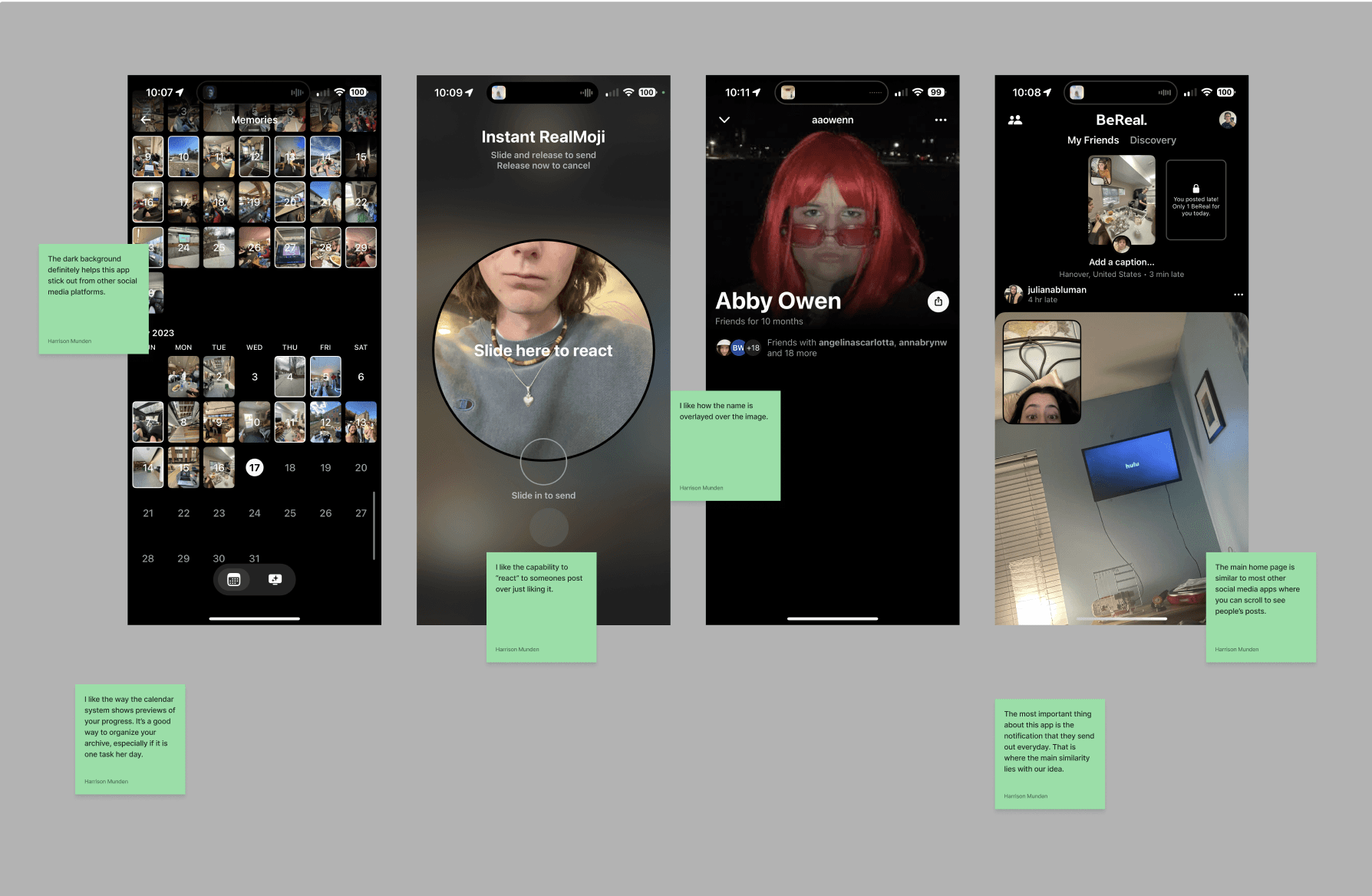
Stamps function as a sort of customizable ‘like’ button that show up publicly underneath a user’s stamped posts.
Stamps allow users to visualize their own progress without consciously keeping track of it, and double as a cute way to show off progress to friends.
Users’ personalized stamps will show up under a comment or photo they ‘like’ within the app.
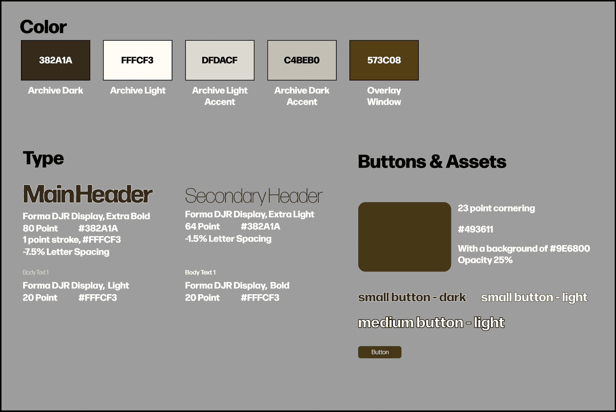
While our primary concern was creating intuitive and simple UI/UX design, we were also interested in cultivating a distinct aesthetic & brand identity that would cater to users in our demographic.
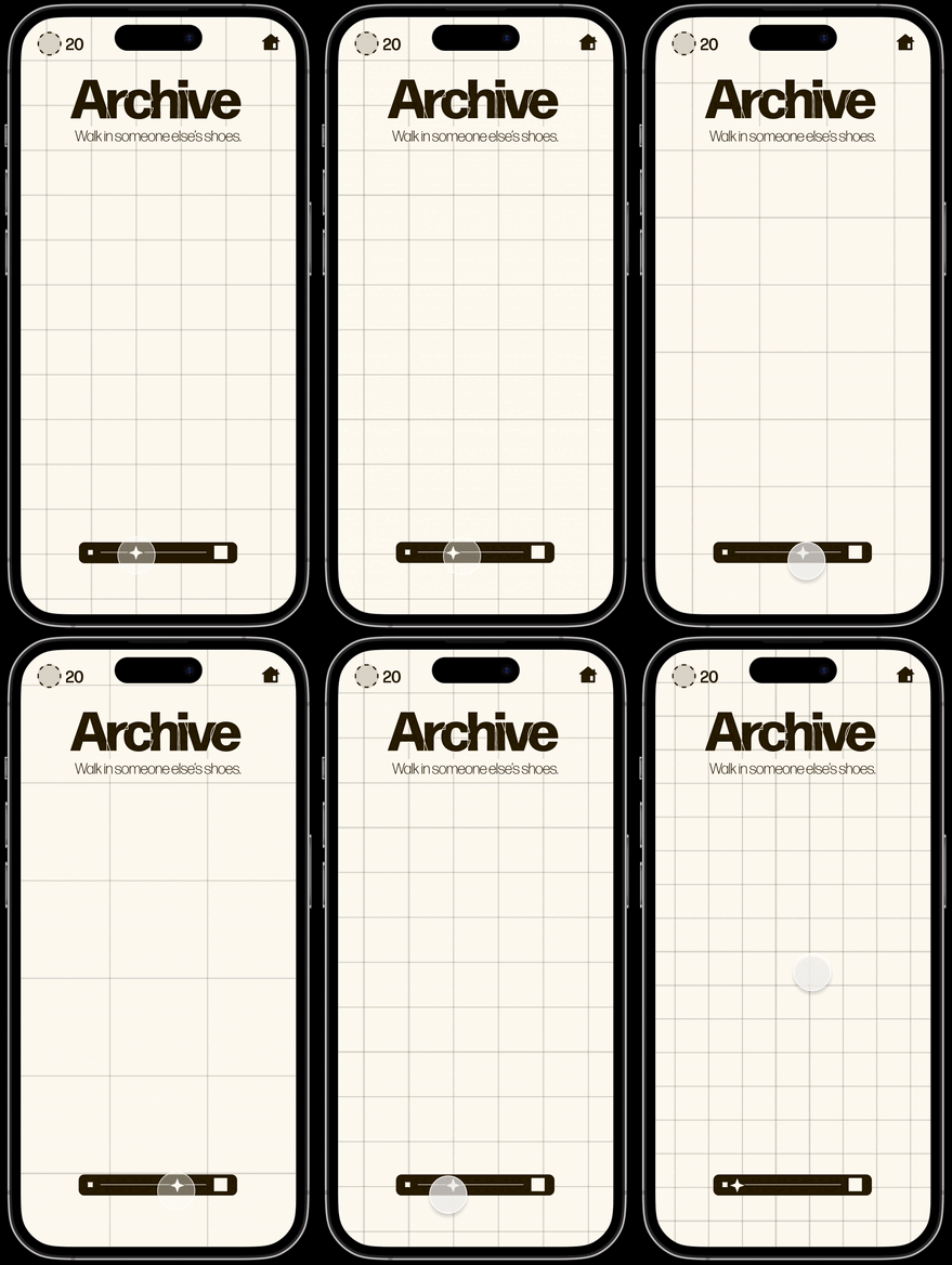
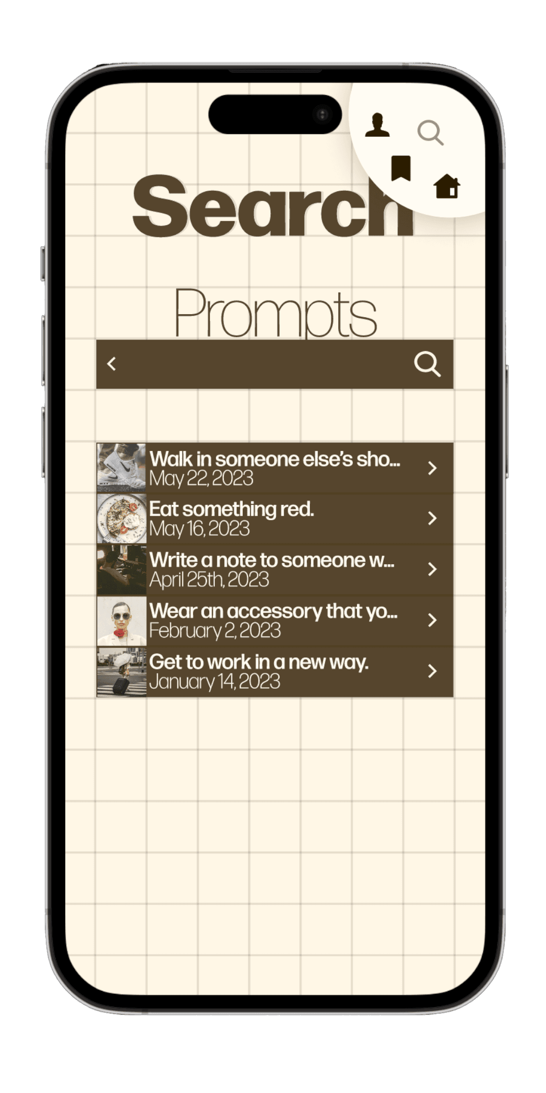
Stills of initial prototype screens for Archive
“When I’m trying something new, I like to do it with friends.”
“Being in college gives my day a pretty rigid structure.”
“Sometimes it feels like too much effort to be switching up my outfit or my meals everyday.”
“I stick to a routine in the morning, but come nighttime I just do whatever.”
👯♀️
🤦♂️
🤷♀️
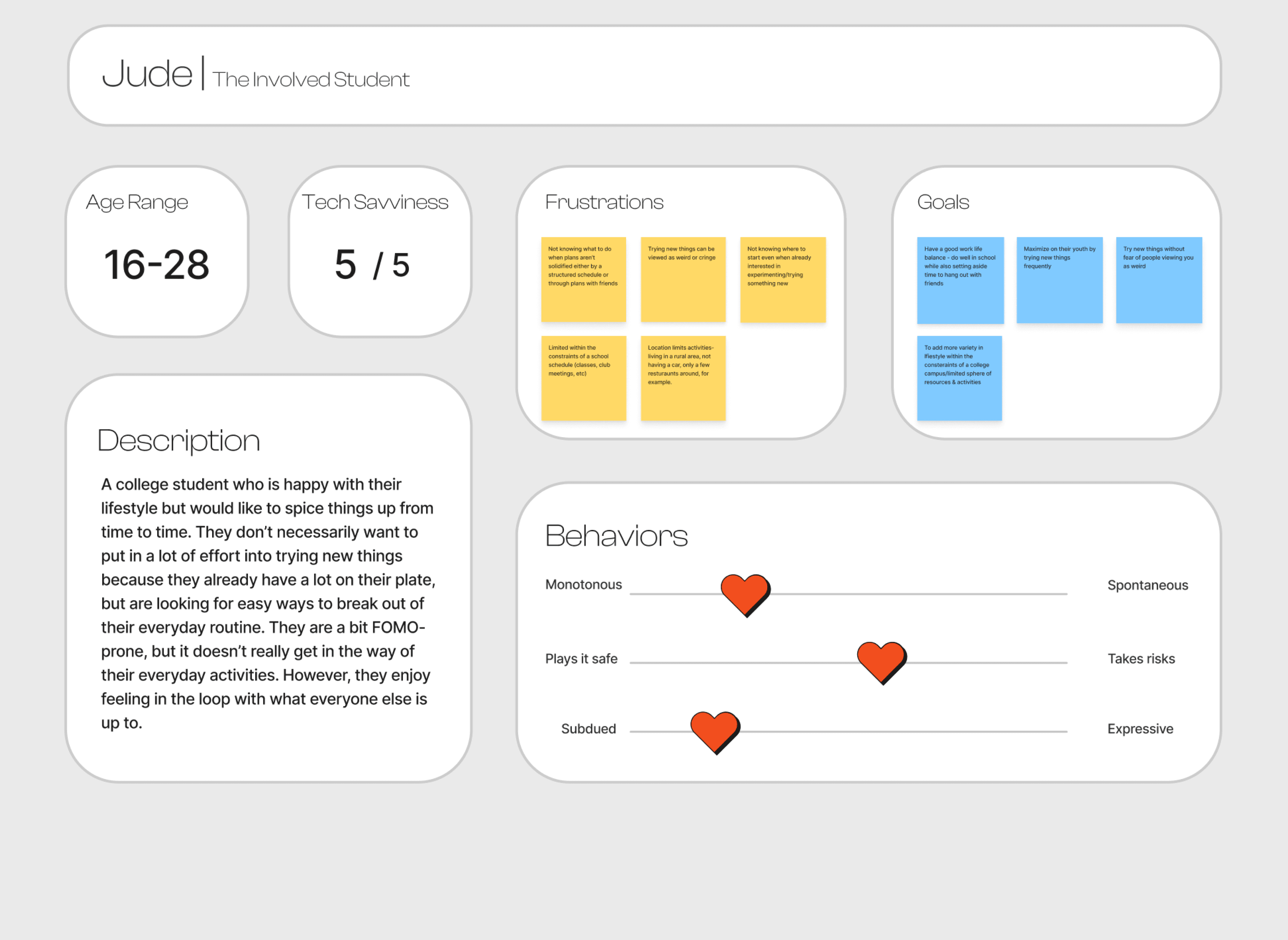
Preliminary user interviews helped us to understand how potential users in our target demographic felt about their daily habits
Archive is a mobile app that sends users one prompt a day. Each prompt encourages users to make a fun change to their routine and take a photo to document it.
Photos can be shared with friends on an Instagram-style feed to make stepping out of your comfort zone a communal effort.
A “stamp” reward system encourages users to keep posting.
Our Overarching Goal
HMW make the idea of leaving your comfort zone feel less daunting?
Users expressed interest in:
Users expressed an aversion to:
making small changes to their daily habits,
introducing variety & novelty into their lives
expending effort to discover the right changes to make in their routines
figuring out how to integrate changes into their routines
trying new things on their own
🙅♀️
🙋
Photo documentation of each memory gives users the ability to sort prompts by how much they enjoyed them.
After some time, users will have built up a database of new things they’ve tried in order of preference

Users didn’t really feel that prompts helped them make substantial change to their routines
We wanted to emphasize both the personal improvement & social media aspects of the app equally
Users were not motivated to continue making posts long-term
The problem to be solved:
The problem to be solved:
Interactive Ratings

How the Ratings System solves it:
How the Stamp System solves it:
Prompt ratings are publicly displayed, and part of the fun in making routine changes a communal effort.
FEATURES
We decided to move forward with a social media app that sends users a new prompt every day, but we still had a lot of questions to work through.
How do we make the prompts interesting, fun, and easy to complete?
How do we encourage people to come back?
Will each user get the same prompt?
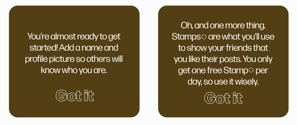
You’re almost ready to get started! Add a name and profile picture so others will know who you are.
Got it
Oh, and one more thing. Stamps are what you’ll use to show your friends that you like their posts. You only get one free Stamp per day, so use it wisely.
Got it
We modified existing features based on user feedback
We brainstormed more prompts.
We expanded our onboarding process with more overlays.
We asked users what kinds of tasks seemed most exciting to them
The prompts were not accessible, too confusing, or
too hard.
Users lost motivation to keep posting.
The onboarding process was unclear.

We added a “stamp” system where users can unlock and collect different stamps by posting frequently. Users can display these stamps on their profile and use them to show support for their friends’ posts.
Oh, and one more thing. Stamps are what you’ll use to show your friends that you like their posts. You only get one free Stamp per day, so use it wisely.
Got it
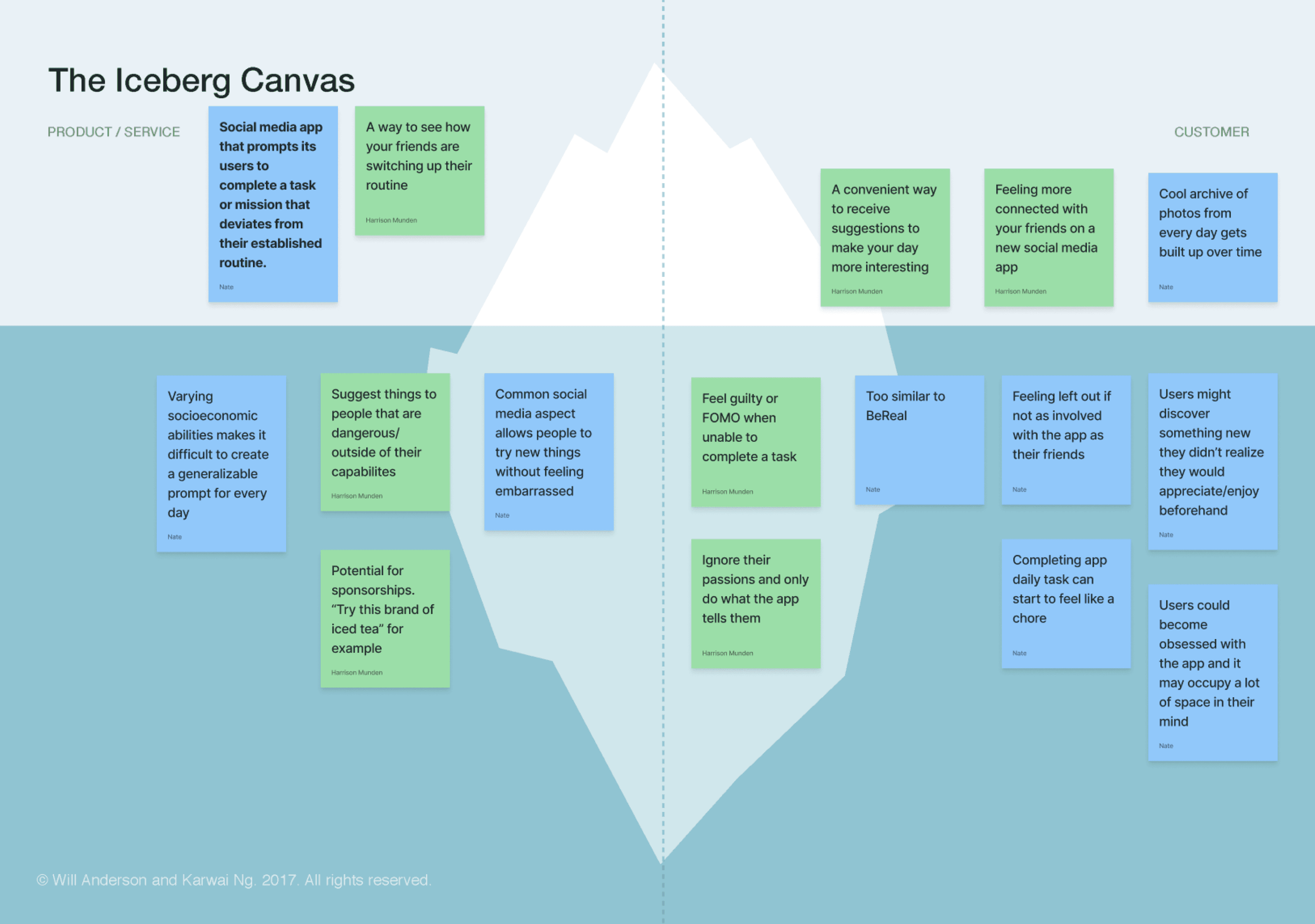
Traditional research methods such as industry research, user personas, and journey mapping proved to be insightful in solidifying a vision for Archive.
Yes
No
Interact with friends via stamps & comments
View interactions on today’s post
Answer today’s prompt with a post
Sort prompts by rating
Discover new friends & posts
View Archive of past prompts
Visit explore page
Visit homepage
View feed
Today’s prompt answered?
Yes
No
Start
Login/Sign up
Profile setup
Answer your first prompt
Add friends
Exploration
Stamp customization onboarding
Customize Stamp
High level userflow
Onboarding
Basic App Functions
Everyday activities
Stamp onboarding complete?
View Stamp Customization Page
Click on somewhere in app with Stamp symbol
View profile
Stamps arose later in the design process, out of a necessity to motivate users to keep posting
Once we had our initial prototype set up, we conducted user testing to see what was working and what wasn’t.
Prioritize building a strong foundation first. Despite Archive being just a month-long project, my partner and I had quite a few ambitions. At some points, we spread ourselves too thin trying to integrate all the features we found exciting. In the end, we had to scrap some interesting concepts and we lost space to completely flesh out other functions more central to our vision for Archive. If I were to do this project again, I would prioritize project management more and map out a hierarchy of needs with my team.
Don't be afraid to iterate on existing conventions. Social media in particular is a platform with many UI elements that have proven to be effective for decades. In our case, it was tempting to default to these methods, but brainstorming with an open mind allowed us to discover unorthodox solutions that were received more positively by our testers.
Plan testing around limitations. As an app that is contingent upon long-term user interaction, we needed to be sure that testers would actually want to engage with Archive long-term. Although we were able to perform some day and week-long testing, longer-term testing would have been ideal to really stress-test our app’s concept.
In undertaking this project, my partner and I engaged critically with the design thinking process to produce a uniquely delightful social media/self improvement app that our target audience expressed immense interest in!


Our goal was to create a platform where users would feel empowered to try new things without feeling pressured or isolated in their endeavors.
Style Guide
